Art Direction at Meta
As an Art Director at Facebook App, I contributed to product campaigns while also shaping the illustration systems that helped define a consistent visual voice across the app. Here are some key examples.

FLEX Illustration System
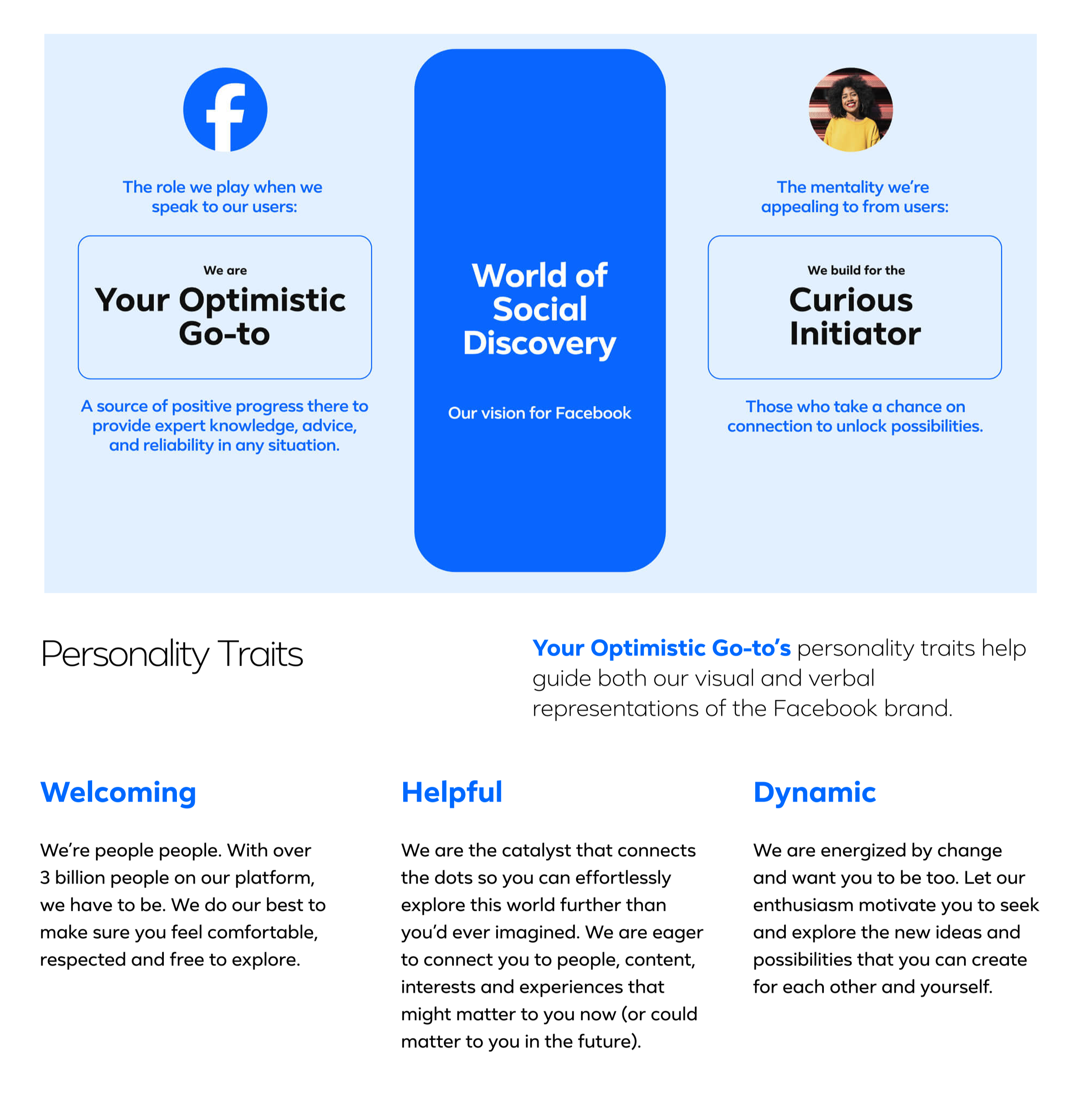
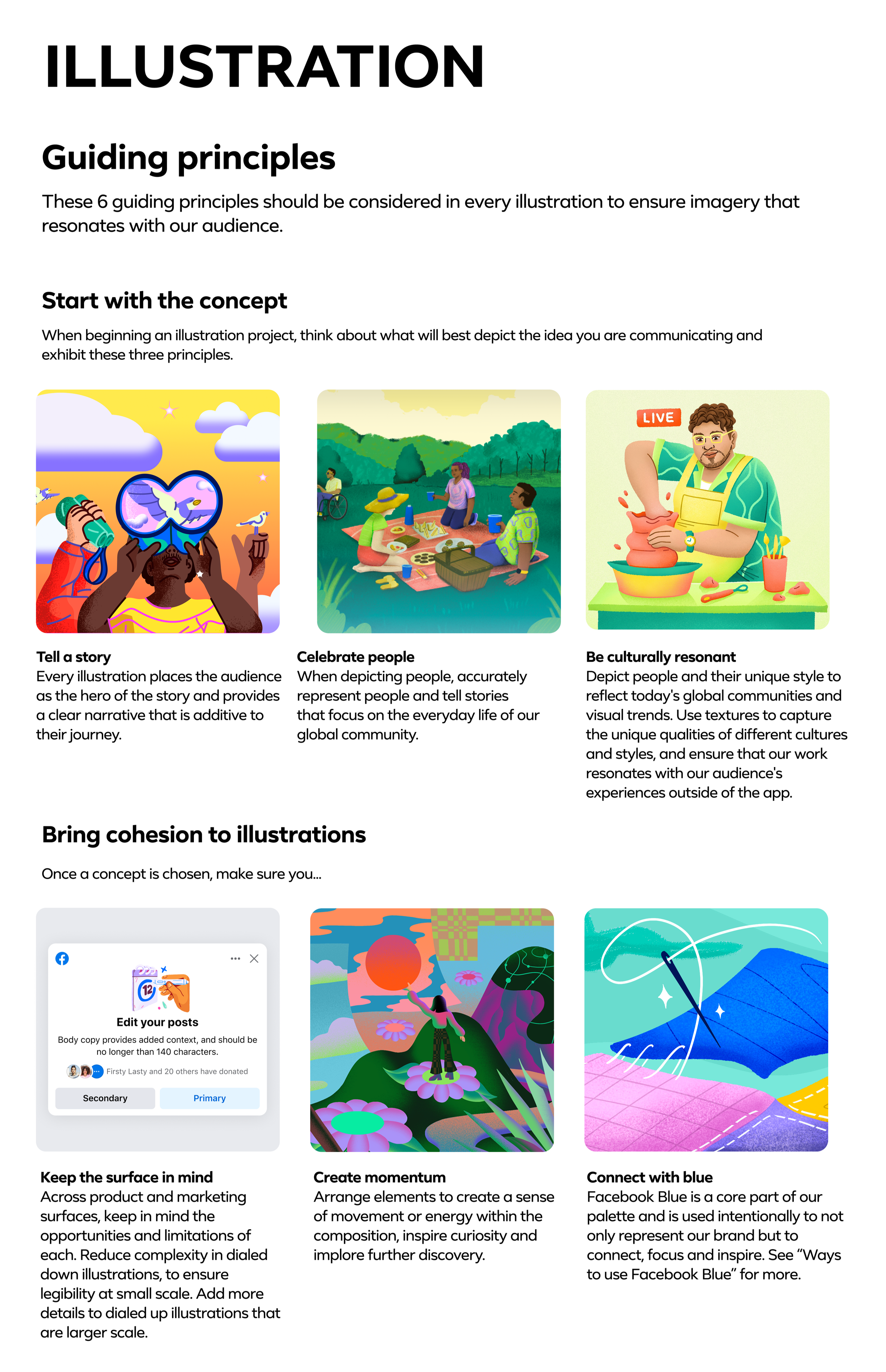
I was part of the team that built the FLEX illustration system, focusing on art direction and the conceptual thinking behind how the styles should work. My role centered on guiding artists, shaping the visual logic, and helping the system scale across Facebook’s huge and incredibly diverse audience.
FLEX was designed to move with visual culture and carry a sense of radical welcome. Its 2D and 3D styles can dial up or down depending on the moment, each one building on the next so the system stays cohesive, flexible, and personal while supporting a wide range of needs.
Creator Milestones
I created a focused art direction brief and worked closely with illustrator Lucia Pham, guiding the work through multiple rounds of critique to shape a cohesive visual language. My focus was keeping the system warm, scalable, and flexible enough for seasonal moments and special updates, while making sure each illustration supported the larger creator journey.




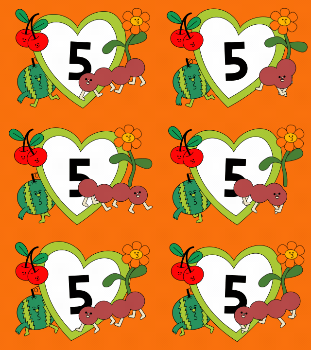
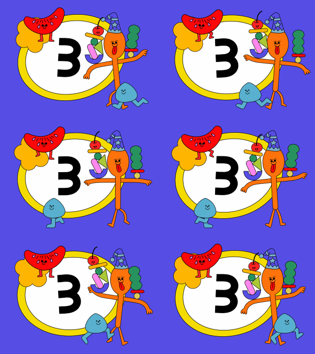
Visuals created in collaboration with Lucia Pham.
Creator tools Onboarding
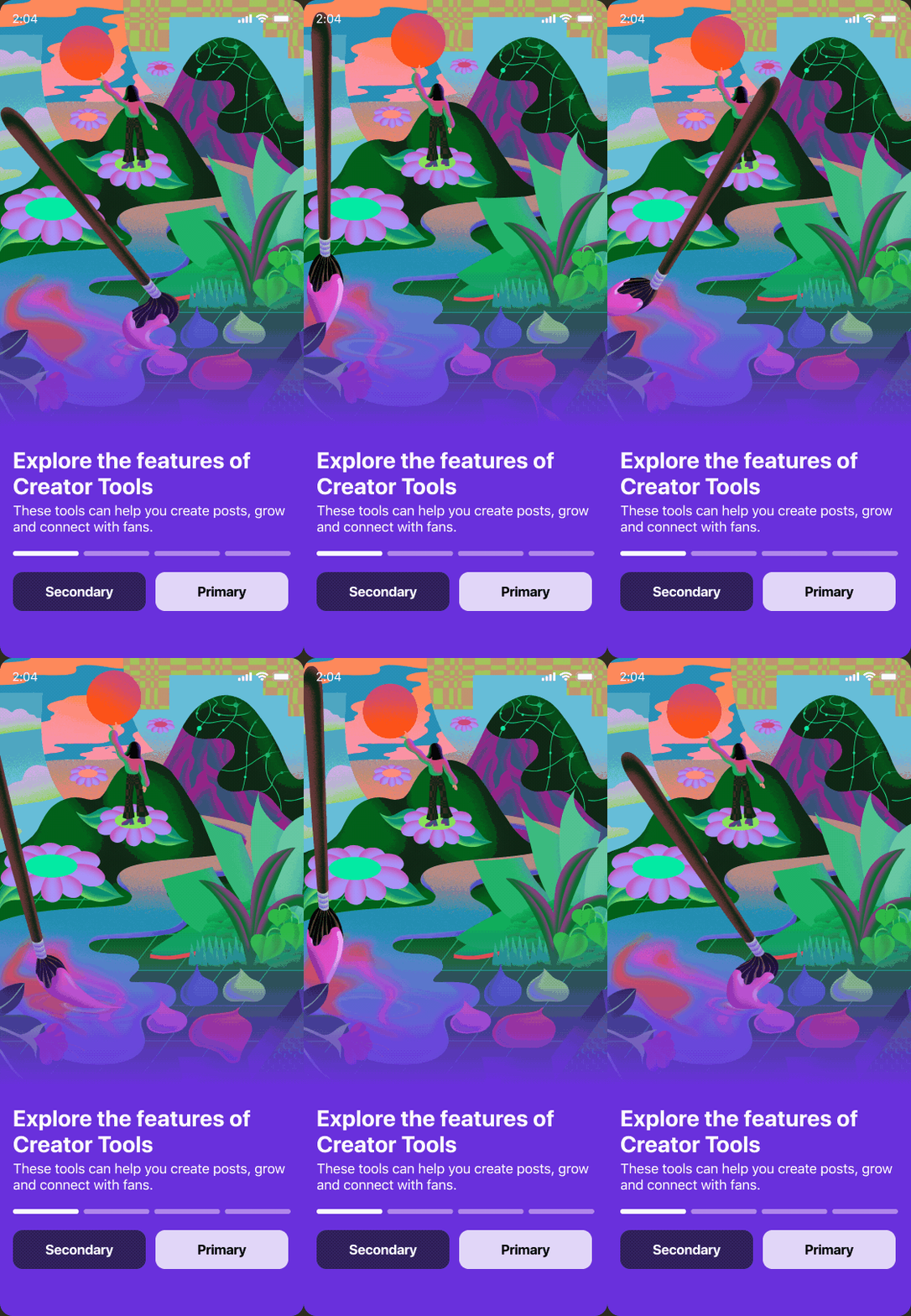
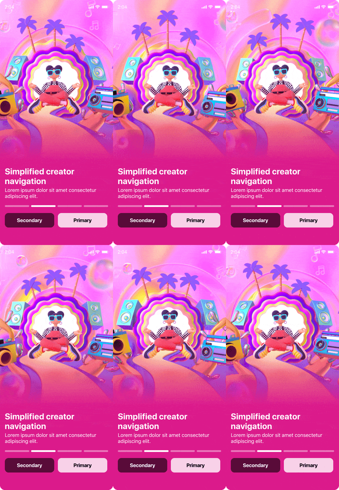
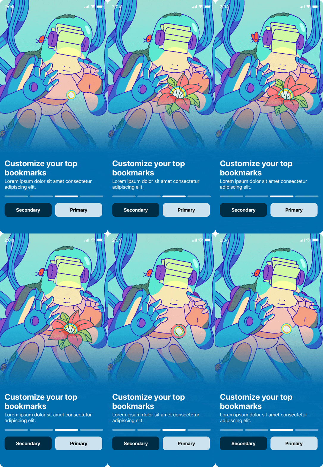
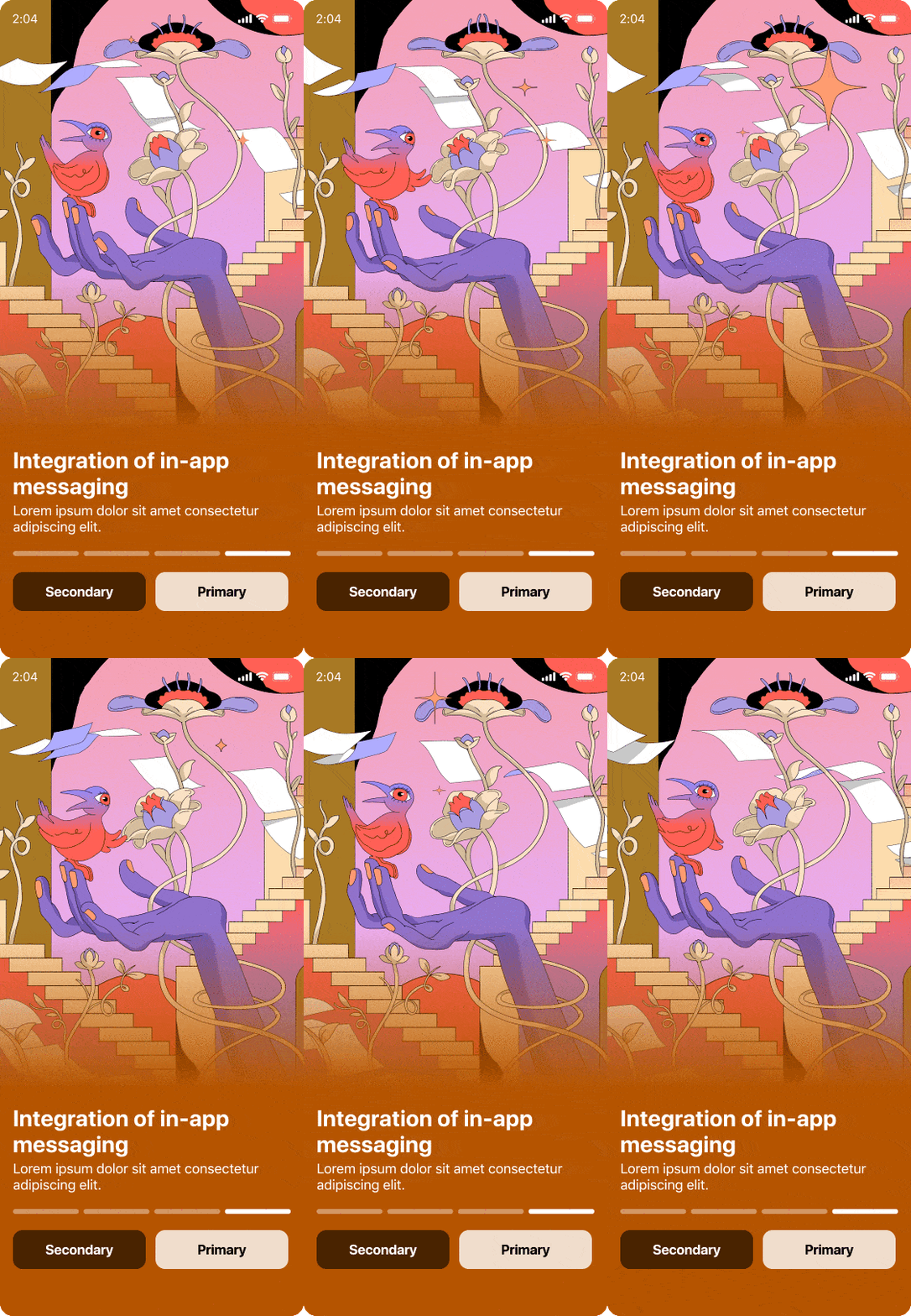
For Creator Onboarding, I wanted to show the visual system at its most expressive. The goal was to introduce creators to the program and highlight its key features in a way that felt energetic and inviting. My concept was to reflect the diversity of our users in the work itself, so I partnered with four different artists, each with their own distinct style. The result was a set of visuals that felt fresh, varied, and true to the wide range of creators joining the platform.
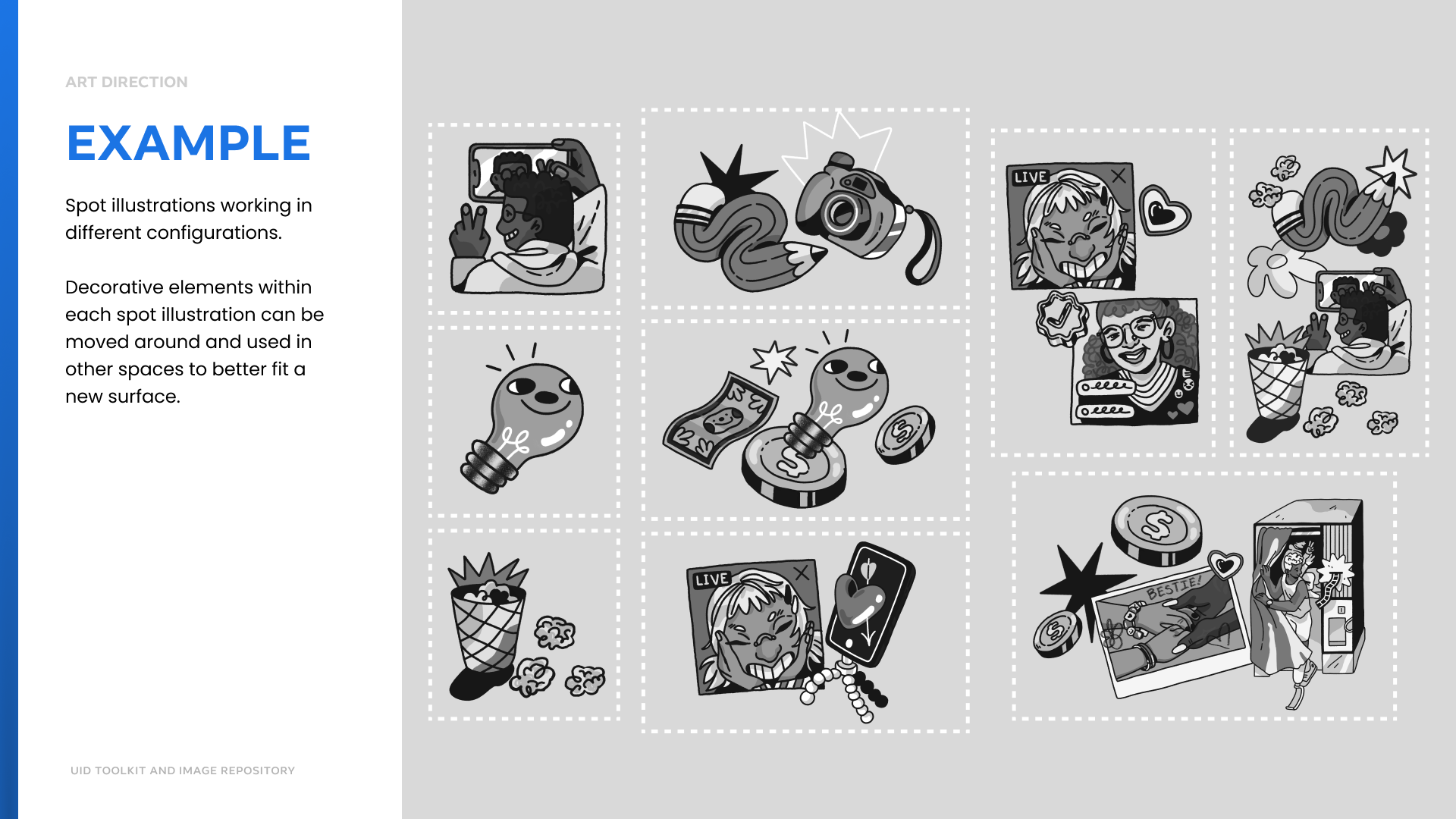
SPOT Illustration Toolkit
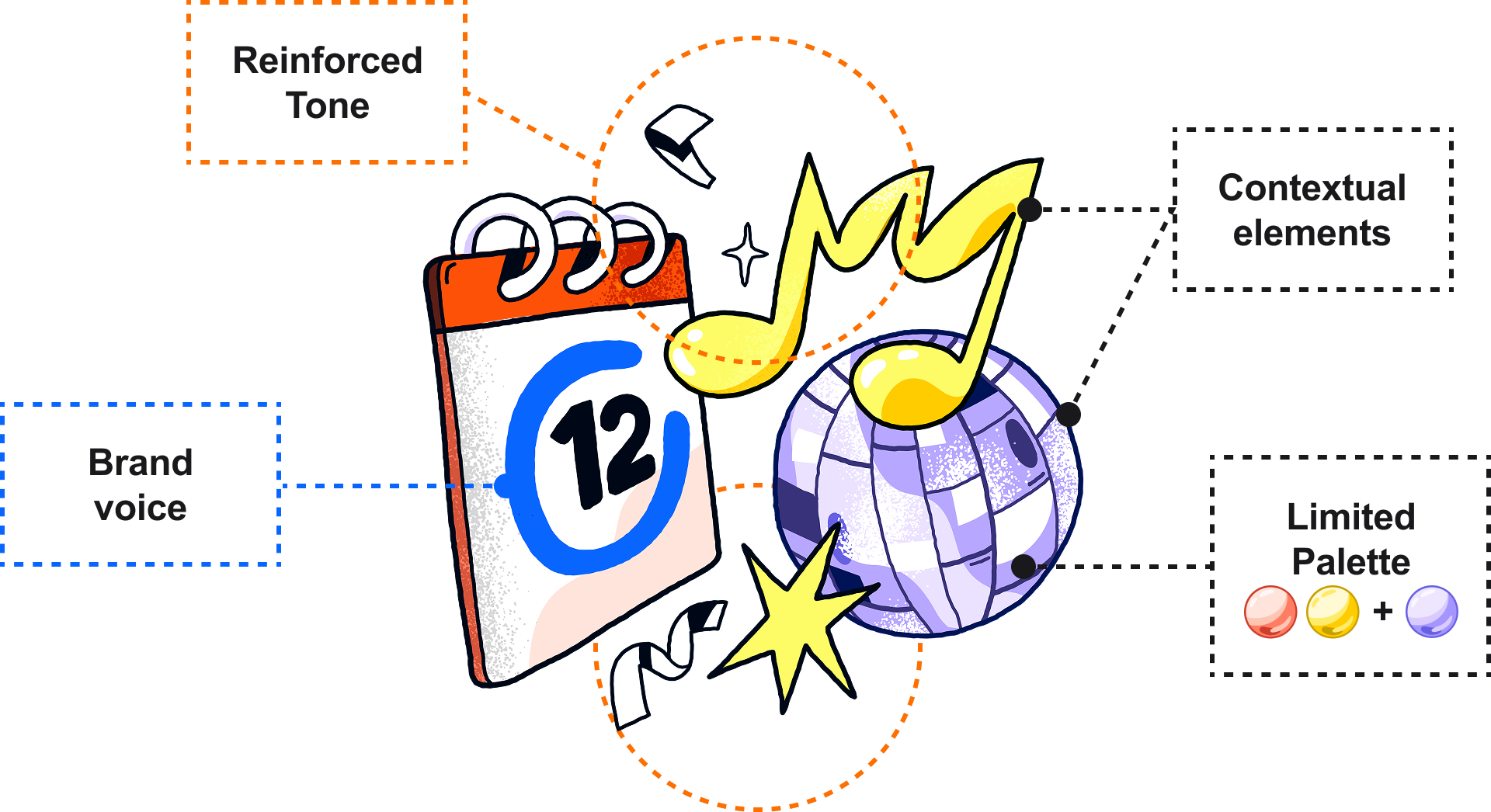
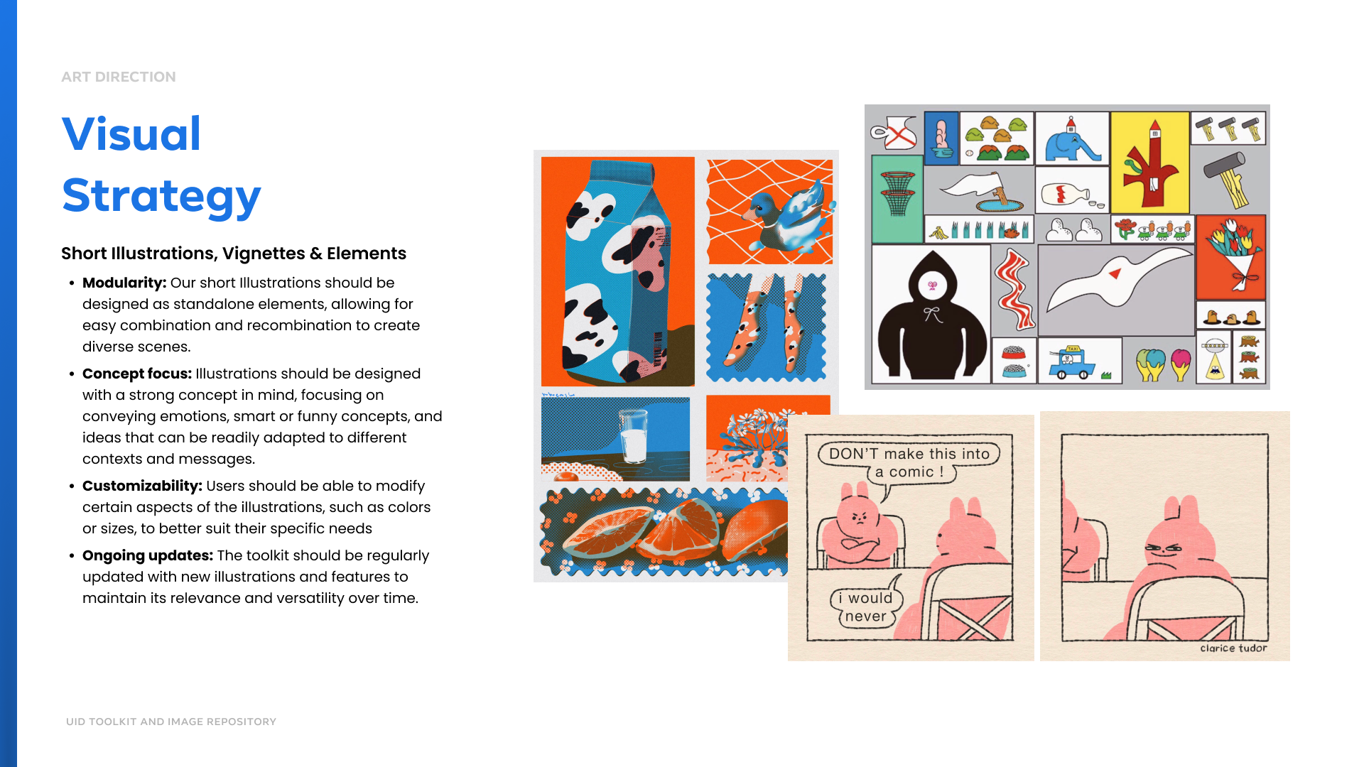
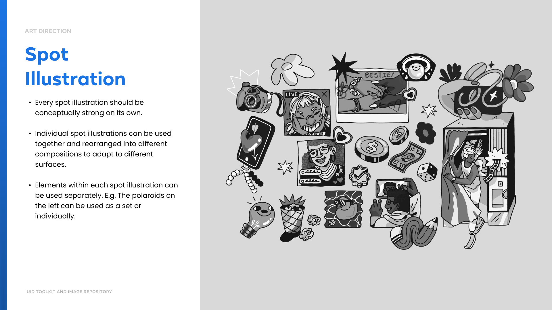
I created a spot illustration toolkit built around the themes and moments teams request most. The goal was to give designers a flexible way to build scenes without starting from scratch.
The system is modular, so each illustration works on its own or can combine with others to create new compositions. Every piece starts with a clear concept, making it easy to use across different messages. It is also customizable, with adjustable color and scale that keep it adaptable without losing consistency. And it is built to grow, with ongoing updates that keep the toolkit fresh and useful over time.
Ads Privacy personalization
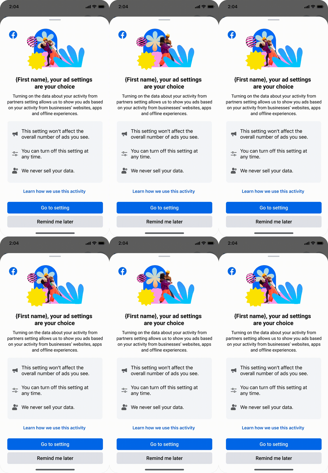
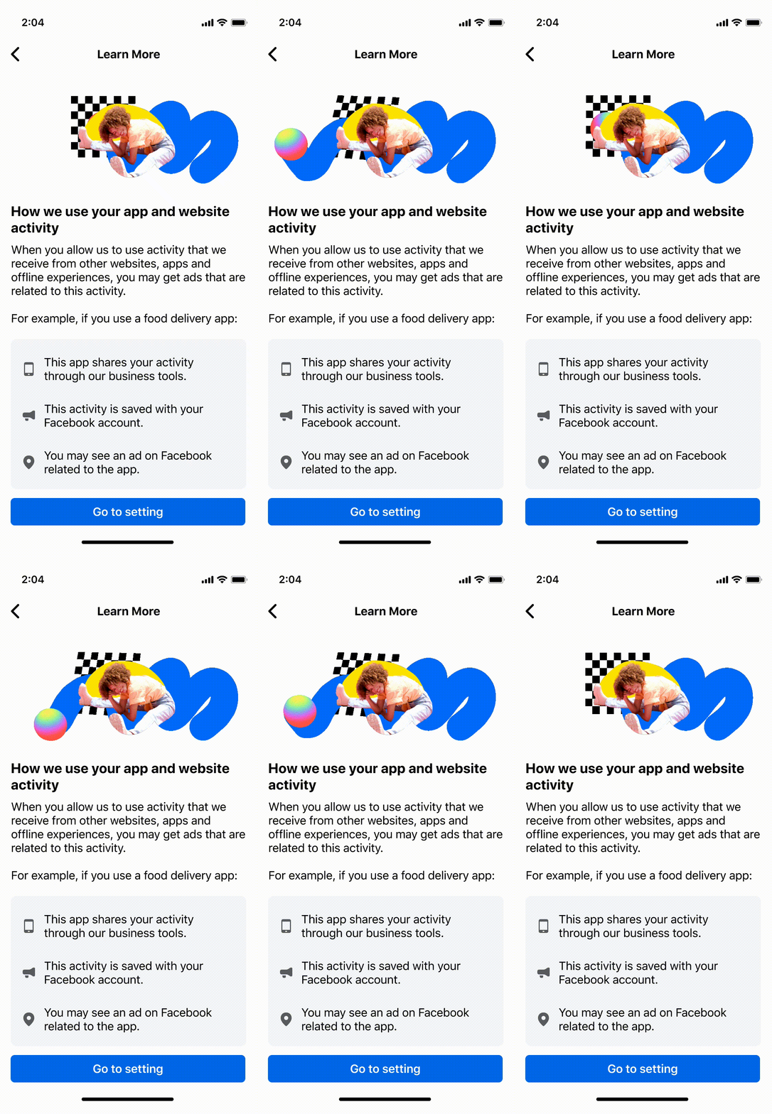
The Ads Privacy team wanted to help people understand how their data shapes the ads they see and how to adjust that experience in a way that actually feels helpful. They partnered with me and my team to build new interactive flows that walk users through those choices, paired with visuals that feel energetic, motivating, and clear so the whole thing stays informative without feeling heavy.
